You’ve spent hours (okay, maybe days) crafting your offer – the copy is thoughtful, the graphics are on-brand, and the layout looks polished. But when someone lands on your sales page… they bounce. Fast.
The problem might not be your pricing, your product, or your pitch.
It might be your visuals – and more specifically, that they’re inaccessible.
Think: tiny fonts, low contrast, text buried in images, or confusing jargon.
The gist: Inaccessible visuals are design choices, like tiny text or low color contrast, that keep people from reading or understanding your content. Making your visuals accessible helps everyone engage with your offers and builds the trust that leads to lasting relationships and sales.
Part of the Marketing Accessibility series.
What looks fine to you might be blocking real people from understanding, connecting with, or even seeing your offer in the first place.
Inaccessible visuals don’t just create confusion – they quietly shut people out. And when people feel excluded, they’re not sticking around to buy… or to build a relationship.
In this post, we’re digging into the often-overlooked impact of inaccessible visuals – how they create invisible barriers, break trust, and limit both relationships and revenue. If you're committed to ethical, inclusive marketing, this is where we start: by making sure people can actually access what you're offering.
What Makes Visuals Inaccessible?
Visual accessibility isn't just about “making things pretty.” It's about making sure everyone – regardless of how they see, process, or interact with content – can actually engage with your message.
When visuals are inaccessible, they create friction. That friction doesn’t just cause confusion – it can make people feel unwelcome, overwhelmed, or even excluded. And that’s the opposite of ethical, relationship-centered marketing.
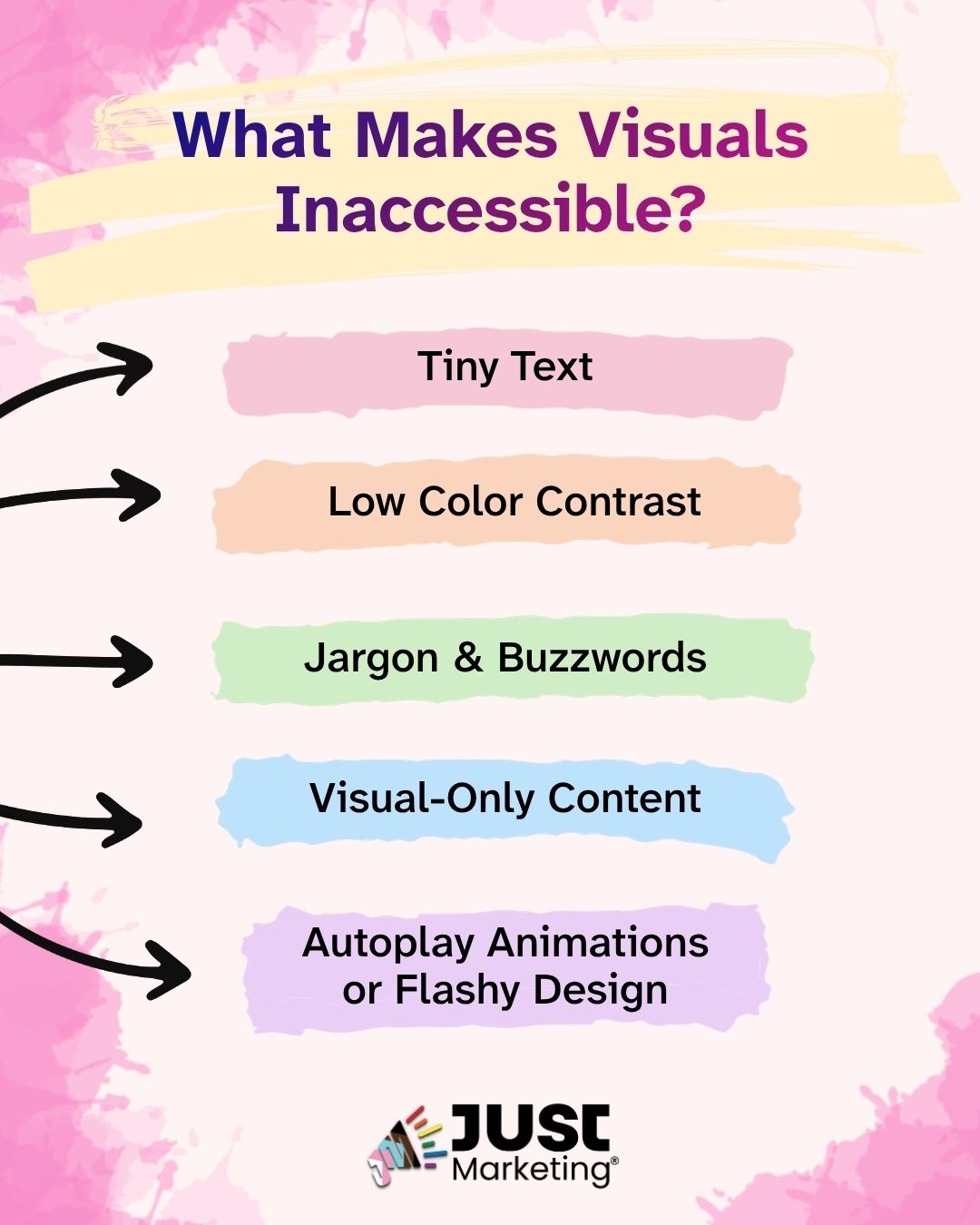
Let’s break down a few common culprits:
1. Tiny Text
If someone has to pinch and zoom or squint to read your offer, they’re already halfway out the door. Small fonts may look sleek on desktop but can be unreadable on mobile – especially for folks with low vision or processing differences.
Tip: Stick to at least 16px body text, and test on multiple devices.
2. Low Color Contrast
Light gray text on a white background might feel on-brand but if it’s not legible, it’s not working. Poor color contrast makes your content hard to read, especially for people with low vision, color blindness, or sensory sensitivities.
Don’t assume that because you can decipher the words, that everyone can. Be sure to use a tool like the WebAIM Contrast Checker.
3. Jargon & Buzzwords
When your copy is filled with industry terms, acronyms, or vague promises (“quantum leap your biz!”), it creates cognitive overload – especially for neurodivergent folks. Plain language is not oversimplifying things – it’s opening it up. Write like you’d explain it to a friend over coffee.
4. Visual-Only Content
Posting a graphic with no alt text? Embedding key info in an image with no text version? Folks using screen readers (or just scrolling quickly) might never get the message. Always include alt text or a text-based version of important visual content.
5. Autoplay Animations or Flashy Design
GIFs, carousels, and pop-ups can create sensory overload and literally prevent someone from staying on your page – especially those with ADHD, autism, or vestibular disorders. Avoid autoplay when possible, and always give users control.
If someone can’t see, read, or understand your offer, they can’t connect with it. And when connection breaks, so does trust.
Why Does Visual Accessibility Matter for Sales?
Most marketing advice out there is laser-focused on conversions, not connection. But here’s the truth that often gets buried under all the “sales funnel hacks” and “7-figure launch secrets”… People buy from people they trust. And trust begins with feeling seen, welcomed, and respected – from the very first click.
Inaccessible Visuals Break Trust
When someone lands on your offer and is met with unreadable text, overwhelming visuals, or confusing language, it sends a subtle but powerful message:
“This wasn’t built for you.”
That doesn’t just slow down the sale. It stops the relationship before it even starts.
And for many of the folks you most want to serve – neurodivergent folks, people with disabilities, people navigating tech access barriers – this isn’t a one-time frustration. It’s a repeated exclusion they encounter over and over again.
Visual Accessibility = Relationship-Centered Marketing
When your visuals are accessible, you’re not just improving user experience – you’re practicing ethical inclusion. You’re saying:
- I want you here.
- I respect your time and energy.
- I’ve thought about your needs.
- This space is designed with care – and with you in mind.
That kind of intentionality builds trust.
Trust creates connection.
And connection leads to sustainable, values-aligned sales.
Visual accessibility isn’t just a “nice-to-have” design choice. It’s a foundational part of building real relationships – and making sure your offers are as inclusive as your mission.
How Can I Make My Visuals More Accessible?
Now that we know how inaccessible visuals can quietly block relationships and sales – what do we do about it?
Visual accessibility isn’t about perfection. It’s about thoughtful, doable shifts that invite more people into your world. And you don’t need a design degree or a giant team to get started.
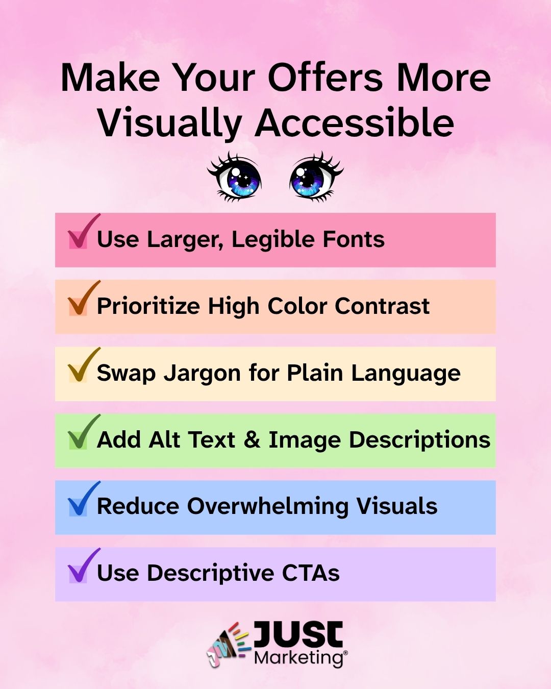
Here are a few practical, ADHD-friendly tips to start making your visuals more inclusive right now:
1. Use Larger, Legible Fonts
Small text might look sleek, but it’s not doing anyone any favors.
- Aim for 16px minimum for body text.
- Use clear, readable fonts – skip the swirly cursive or ultra-lightweights.
Bigger text means less cognitive strain, which helps everyone – not just those with visual access needs.
2. Prioritize High Color Contrast
If you’re not sure whether your text “pops” enough, chances are it doesn’t.
- Use tools like WebAIM’s Contrast Checker to make sure your text is at least a ratio of 4.5:1 for regular text, so that it stands out from your background.
- Avoid light gray on white, pastel on pastel, or text over busy images.
Black on white isn’t boring – it’s accessible.
Read more about Color Contrast.
3. Swap Jargon for Plain Language
You’re smart – your content doesn’t need to sound complex to be valuable.
- Avoid industry-specific acronyms or fluffy language.
- Explain your offer like you’re talking to a friend (who might be new to your world).
This is especially helpful for neurodivergent folks who need clarity and direct communication to process info effectively.
Learn more about Plain Language.
4. Add Alt Text and Image Descriptions
If someone’s using a screen reader or if images don’t load, they still deserve the full experience.
- Add alt text to every image on your website.
- For image-heavy content (like social posts), include brief image descriptions in the caption or post text.
Access is more than a checkbox – it’s about being thoughtful with your message.
5. Reduce Flashy or Overwhelming Visuals
Autoplay videos, endless carousels, or fast-moving GIFs can create sensory overload.
- Avoid autoplay where possible.
- Give users the ability to pause/skip moving elements.
- Keep layouts clean and focused – don’t overcrowd with text, colors, or animations.
This makes your content way more ADHD-friendly, too. Less chaos means more clarity.
6. Use Descriptive CTAs
“Click here” doesn’t tell folks what they’re actually getting.
- Try CTAs like “Download the guide,” “Book your free consult,” or “Learn how to create accessible offers.”
- Make sure buttons and links are easy to spot, with strong contrast and adequate spacing.
It’s a small tweak, and a big accessibility win.
Remember: Accessibility isn’t all-or-nothing.
Start where you are, and layer it in. Each shift you make creates a more welcoming space for someone – and that’s the kind of marketing that truly matters.
Progress, Not Perfection
Once you start thinking about accessibility, it can feel a little overwhelming. Suddenly you’re noticing all the things you could improve – fonts, colors, alt text, structure… oh my.
Take a breath. This isn’t about shame or perfection – it’s about intentional progress.
You’re Not “Behind.” You’re Growing.
Most of us didn’t learn accessible design principles when we first started our businesses. That’s not your fault – it’s a reflection of an industry that prioritizes aesthetics over access.
The fact that you’re here, reading this, and asking these questions?
That matters. That’s leadership.
Start Where You Are. Build As You Go.
You don’t need to redo your entire website overnight. You can:
- Start by checking the contrast on your most-visited sales page.
- Choose a larger font size in your next email.
- Write one post this week using plain language and a clear image description.
Tiny, intentional changes – repeated consistently – create more accessible, inclusive experiences for everyone.
Accessibility is Ongoing – and That’s a Good Thing
There’s no finish line. And that’s kind of beautiful, right?
Because every time you audit your visuals or rewrite something more clearly, you’re deepening your relationships. You’re building trust. You’re practicing the kind of marketing that feels good – to you and to your people.
You don’t need to be perfect to be inclusive.
You just need to care – and to take action, one step at a time.
Inclusion Builds Connection – and Connection Builds Business
If your offers aren’t visually accessible, it doesn’t matter how brilliant your strategy is – the people who need you most might never make it past your headline.
This isn’t just about fixing fonts or checking boxes. It’s about removing barriers so your work can reach the people it’s meant to serve.
When your visuals are accessible, your marketing becomes more than a sales tool – it becomes an act of care. It shows your audience that you see them, value them, and designed your business with them in mind.
Inclusion isn’t just the right thing to do – it’s the sustainable thing to do.
Because when you build trust through accessibility, you don’t just increase conversions… you create community.
Let’s Keep This Conversation Going
- Connect with me on LinkedIn or Instagram – I’d love to hear how you're making your visuals more inclusive.
- Curious about working together to create values-aligned, accessible offers? Learn more about how we can collaborate.
- Want tips like this delivered straight to your inbox? Join my email list for ethical, ADHD-friendly marketing support.
FAQs
A body text size of at least 16px is a widely recommended starting point. Clear, simple fonts are easier to read than thin, decorative, or script styles. Testing your pages on a phone helps you catch text that's too small on smaller screens.
The Web Content Accessibility Guidelines (WCAG) recommend a contrast ratio of at least 4.5:1 for regular text and 3:1 for large text. Free tools like the WebAIM Contrast Checker let you test any text and background color combination in seconds.
Alt text is a short description added to an image's code, which screen readers read aloud and search engines use to understand your content. An image description is written in the post or caption itself, so everyone can read it, which is especially helpful on social media. Learn more about writing meaningful alt text.
Moving content can overwhelm people with ADHD, autism, or vestibular disorders, and it can make a page hard to focus on. Giving visitors a way to pause or stop motion makes a big difference, and WCAG asks for pause controls on content that moves for more than five seconds. When in doubt, skip autoplay.
Accessible calls to action describe exactly what happens next, like “Download the guide” or “Book your free consult,” rather than “Click here.” Buttons and links also need strong color contrast and enough spacing so they're easy to spot and tap.
Start small with the pages people visit most, like checking the color contrast on your main sales page or adding alt text to your newest images. Each small change makes your marketing more welcoming. Just Marketing® is ethical, inclusive, and accessible, so your audience feels supported and your business grows sustainably. Explore the complete guide to Just Marketing®.