Ever landed on a sales page and instantly felt your brain short-circuit?
Too many tabs open (literally and mentally), too many options, too much copy – and none of it feels like it’s for you. For neurodivergent folks especially, traditional sales experiences can be a masterclass in cognitive overload.
And it’s not just frustrating… It’s exclusionary.
When we talk about accessibility in marketing, visual and physical accommodations often come to mind first – but cognitive accessibility matters just as much. It’s about reducing the mental load involved in understanding, processing, and responding to a sales message.
The gist: Cognitive accessibility means designing your offers so people can easily understand and act on them, which is especially important for neurodivergent buyers. Lead with a clear recommendation, use plain language and consistent design, break next steps into small actions, and let people know it’s okay to take their time.
The World Wide Web Consortium (W3C), which publishes the international web accessibility guidelines, offers detailed guidance on making content usable for people with cognitive and learning disabilities, including tips like keeping text succinct and adding summaries to long pages.
In this post, we’ll unpack what cognitive accessibility actually looks like in your offers. We’ll explore how decision fatigue, executive dysfunction, and overwhelm show up in sales experiences. And we’ll walk through practical ways to build sales content that’s easier to process, more inclusive by design, and still converts (without compromising your values).
Ready to make your sales feel less like a maze and more like a clear, welcoming path?
What Is Cognitive Accessibility in Sales?
Cognitive accessibility is foundational if you want your offers to be genuinely inclusive. And yet, so many sales strategies rely on pressure, overwhelm, and mental gymnastics to push people toward a purchase.
That might work in high-pressure marketing circles. But if your people are neurodivergent, values-driven, or simply human, that approach backfires. Instead of feeling empowered to make a decision, they shut down.
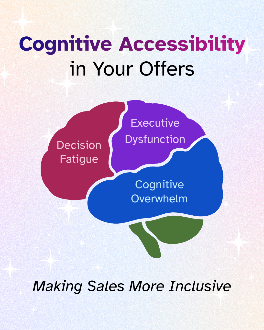
Some of the culprits include:
Decision Fatigue
Decision fatigue kicks in when the brain is asked to process too many options without enough clarity. And in a sales context, it often leads to no decision at all.
Executive Dysfunction
This is a real challenge many folks (especially ADHDers) face. Even if they want to buy or book with you, something as simple as filling out a form, clicking a link, or navigating your checkout process can feel impossible without clear cues and support.
Cognitive Overwhelm
The brain has to work harder to interpret what’s important, what’s true, and what action is expected. That’s when people bounce – because it’s just too much.
When your sales experience feels like a minefield of decisions, assumptions, and urgency… it’s not accessible. But with a few thoughtful shifts, you can design your offers to feel grounded, clear, and kind.
What Makes a Sales Page Hard to Process?
Most sales pages aren’t designed with cognitive accessibility in mind. They're built to convert quickly, often using urgency, complexity, and manipulation. That might work for high-stakes launch campaigns, but it leaves a lot of your audience behind – especially folks navigating decision fatigue or executive dysfunction.
Here’s where things often go sideways:
1. Too Many Options, Not Enough Guidance
Three pricing tiers. Five bonuses. A webinar replay. A fast-action discount. A one-time upsell.
Even with good intentions, this avalanche of choices forces the buyer into cognitive overload. Without a clear path or recommendation, it becomes harder – not easier – to say yes.
2. Jargon and Wall-of-Text Copy
When your copy is filled with marketing buzzwords, long paragraphs, or nested metaphors, your reader has to work to understand it. That’s effort not everyone can spare, especially when they’re already juggling mental fatigue or distractions. Opt for plain language instead.
3. Urgency That Feels Like Pressure
Countdown timers. “Spots are seriously limited.” “Buy now or miss out forever.”
These tactics spike anxiety instead of building trust. Urgency isn’t inherently bad – but when it feels manipulative, it creates stress that blocks decision-making.
4. Unclear or Hidden Calls-to-Action
If your reader has to scroll, reread, or guess where to go next… they probably won’t. A CTA should feel like a well-lit exit sign in a dark room. When it doesn’t, your offer quietly becomes inaccessible.
5. Inconsistent or Cluttered Design
Changing fonts, colors, or layouts mid-page might look artsy – but it disrupts the reader’s ability to follow the flow. Visual inconsistency forces the brain to reorient over and over again, which drains energy fast.
These issues don’t just make your sales process harder to navigate. They communicate – intentionally or not – that your offer wasn’t built with them in mind. And that’s a missed opportunity for connection, trust, and impact.
How Do You Create Cognitively Accessible Offers?
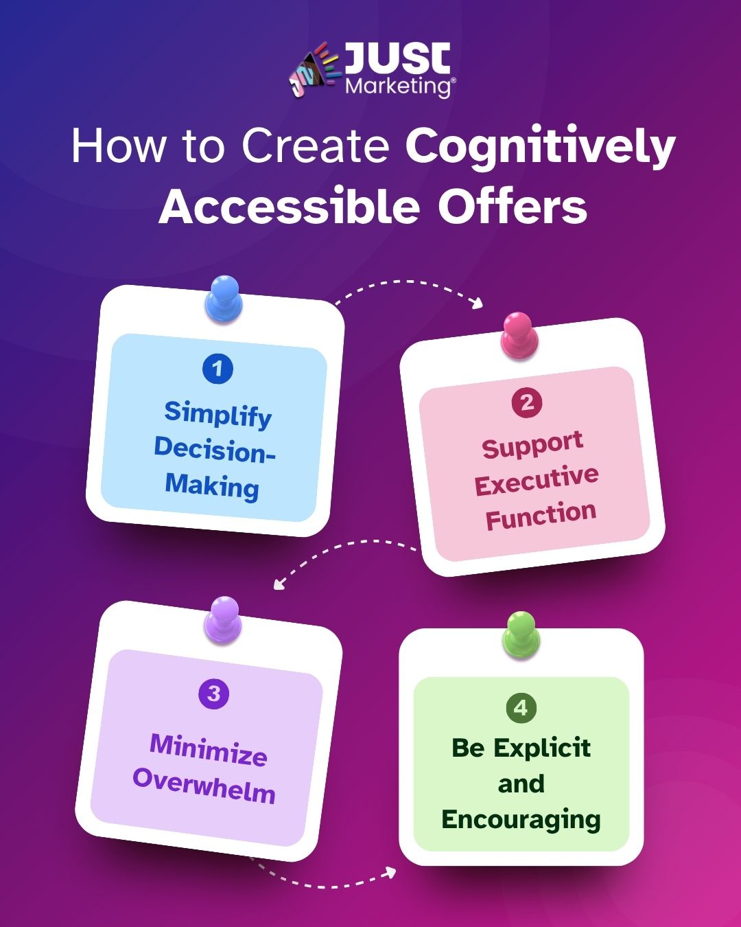
You don’t need to overhaul everything to make your offers more accessible. Small, thoughtful tweaks go a long way. This isn’t about watering down your brilliance – it’s about presenting it in a way that more people can actually engage with.
1. Simplify Decision-Making
- Limit options. If you offer multiple packages, lead with a clear recommendation or a “start here” option.
- Use comparison tables. Build comparison tables as text, with clear column headers to visually show differences without making readers dig.
- Be honest about who it’s for (and not for). Clear boundaries help reduce second-guessing.
2. Support Executive Function
- Use clear, consistent structure. Headers, bullets, and bolding help the brain scan quickly.
- Summarize with a TL;DR. Add a quick overview at the top or bottom of the page. (This is what I do with “The Gist” at the top of my blog posts).
- Break big actions into smaller steps. Instead of “Book a call,” try “Step 1: Pick a time. Step 2: Fill out this 2-minute form.” And embed scheduling tools or direct links so they don’t have to hunt for next steps.
3. Minimize Overwhelm
- Break up dense text. Short paragraphs, white space, and chunked info make reading easier.
- Avoid visual clutter. Stick to a clean design with consistent fonts and colors.
- Be transparent about pricing, time commitment, and expectations. Uncertainty increases stress.
- Add a progress bar or checklist for multi-step offers (like onboarding or multi-month programs).
4. Be Explicit and Encouraging
- Tell people what to expect next. “You’ll get a confirmation email and a prep guide within 24 hours” goes a long way.
- Normalize hesitation. Let folks know it’s okay to take time, ask questions, or come back later.
- Use kind, clear CTA language. Swap “Act now!” for “Let’s explore this together.”
- Add a “Need help deciding?” button or invite to DM you for support. It lowers the barrier to entry without pressure.
This kind of accessibility creates a smoother, more human experience for everyone. It says: “I see you. I respect your energy. And I’m not here to trick or rush you.”
That’s the kind of marketing that builds trust – and converts with integrity.
Why Does Cognitive Accessibility Matter for Your Business?
Making your offers easier to navigate is about aligning your business practices with your values – and making sure those values are felt by the people you’re trying to reach.
Cognitive accessibility is an act of care. It challenges the harmful norm that marketing has to be high-pressure, complicated, or manipulative to work. That narrative doesn't serve you – and it certainly doesn’t serve your audience.
Here’s what shifts when you lead with accessibility:
You Build Real Trust
People don’t just want information. They want to feel safe. When your sales experience is calm, clear, and respectful of their bandwidth, it creates a sense of psychological safety. That trust is what turns curious browsers into aligned clients.
You Expand Your Reach
When your offer is accessible to more brains – not just neurotypical ones – you invite in a more diverse, thoughtful, and values-aligned community. That’s good for your business, your impact, and your mission.
You Sell Without Compromise
You don’t have to choose between doing business ethically and making money. In fact, when people feel empowered to make an informed, pressure-free decision, they’re more likely to say yes – and stay longer. Accessible offers convert because they meet people where they actually are.
Making your sales content cognitively accessible is essential… And it’s one more way to practice Just Marketing® in action.
Ready to Make Your Sales More Accessible?
Creating cognitively accessible offers is about doing things differently – with intention, clarity, and care. When you reduce friction in your sales process, you’re not just making it easier to buy from you. You’re showing your audience that their experience matters.
You don’t need flashy tactics or complicated funnels to grow your business. You need trust, alignment, and messaging that honors how different brains process information. That’s what makes your work truly inclusive – and sustainable.
If you’re curious what it’s like to bring this approach into your marketing…
- Let’s connect over on LinkedIn or Instagram – I’d love to hear how you’re building accessibility into your work.
- Want to explore working together? Here’s how I can support you in simplifying your strategy and aligning your marketing with your values.
- And if you’re not already on the list, join my email community for weekly tips on ethical marketing that feels good to create and consume.
FAQs
Cognitive accessibility in marketing means reducing the mental effort it takes to understand and respond to your content. It helps people with ADHD, autism, learning disabilities, anxiety, or fatigue, along with anyone who’s busy or distracted, engage with your offers more easily.
Decision fatigue happens when someone faces too many choices at once and their ability to decide wears down. On a sales page, multiple tiers, stacked bonuses, and add-ons can lead people to choose nothing at all. A clear “start here” recommendation makes deciding much easier. Learn why giving people room to decide builds trust.
Executive dysfunction can make tasks like filling out a form, finding a checkout link, or scheduling a call feel overwhelming, even when someone truly wants to buy. Breaking actions into small, clearly labeled steps and embedding tools like scheduling links helps people follow through.
Use short paragraphs, clear headings, and consistent fonts and colors. Add a quick summary at the top, be upfront about pricing and time commitment, and make your call to action easy to spot. Telling people exactly what happens next reduces uncertainty too. Learn how to write in plain language.
Countdown timers can create stress that makes clear decision-making harder. If your offer has a real deadline, sharing the date clearly and sending a friendly reminder supports people who benefit from structure without adding pressure. Learn kinder alternatives to high-pressure sales tactics.
Clear, calm sales experiences help more people reach a confident decision, so fewer potential clients drop off from overwhelm. People who buy after a pressure-free experience also tend to stay longer and refer others.