If you've ever looked at your own website and thought, “this doesn't feel like me,” you already understand the starting point for this case study.
That's exactly where DJ Nicholson, founder of Inclusiveology, was before we started working together. Inclusiveology helps teachers build inclusive, student-led classrooms – real tools, real coaching, real belief that every kid deserves to be included in learning. Her old website was professional. She'd built it herself, and for what it was, it did the job. But it didn't sound like the person doing the work, and it definitely didn't reflect an education brand built on accessibility and belonging.
Here's what an accessible website redesign actually changed for Inclusiveology, backed by the numbers, four months of Google Analytics, and a whole lot of social data.
The problem with a “fine” website
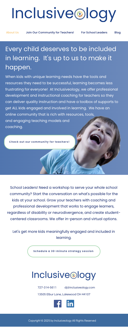
DJ's original homepage was a single screen: a photo hero, one long paragraph explaining the mission, a section for school leaders, and one call to action. Functional. Professional. And, in DJ's own words once the new one was live, “I don't even wanna look at it” anymore.
That reaction is the whole case for why “fine” isn't the bar. A website that's merely professional asks a visitor to take your word for it. A website built around accessible, inclusive design shows them.
| I am sharing an affiliate link for Hello You Designs below. If you click it and buy, I earn a small commission – I'd recommend them even without the commission – and I appreciate when you click through! |
What an accessible redesign actually looks like
This wasn't a coat of paint, and it started with a platform change. The old site was built on Wix; the new one moved to WordPress, starting from a template by Hello You Designs that DJ picked out herself. From there, I customized nearly every piece of it to fit Inclusiveology's brand and the strategy behind this redesign = the template gave us a strong foundation to build on.
From there, the redesign restructured how the site works and how it reads:
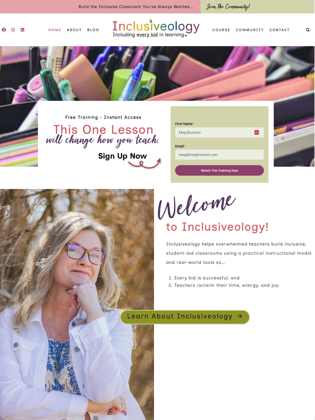
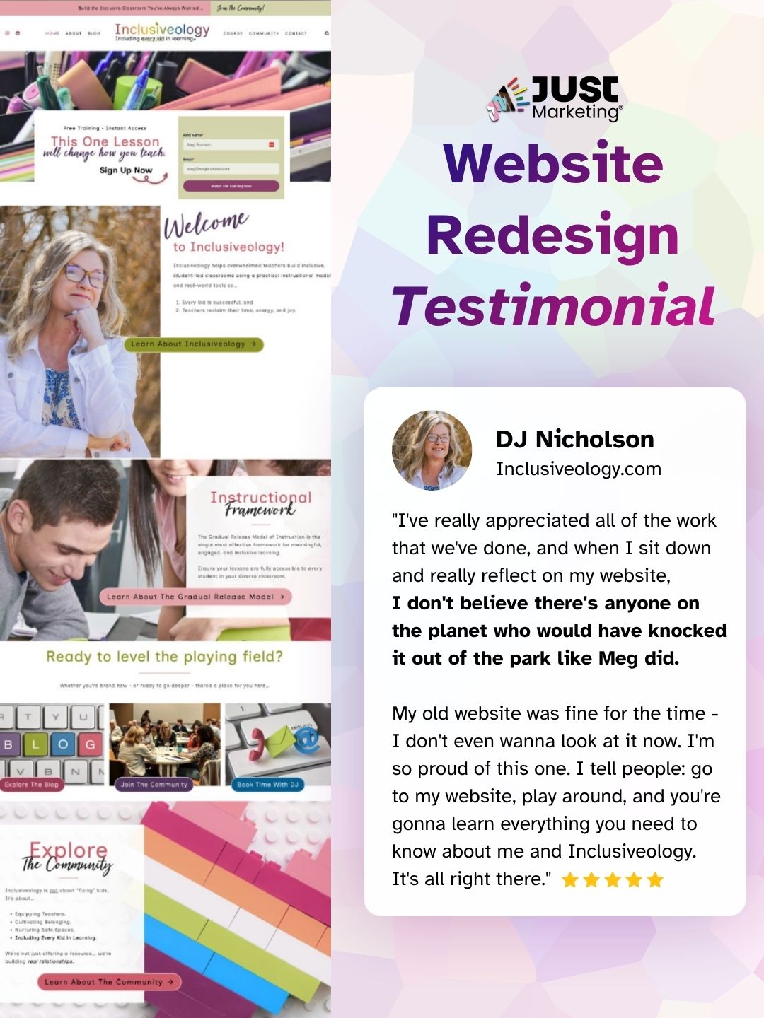
- A brand identity that matches the mission. The old navy wordmark became a colorful, playful logo that visually signals a neurodiversity-affirming brand before a visitor reads a single word.
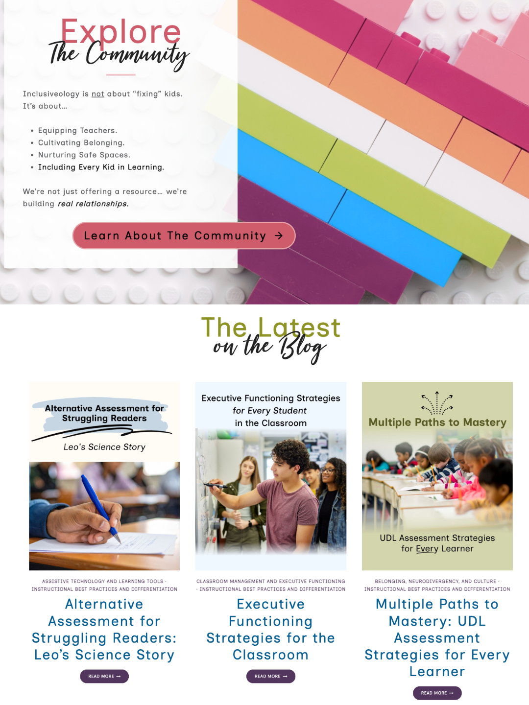
- Content chunked for real attention spans. Long, unbroken paragraphs became short lines, clear headers, and scannable value statements – a direct application of the Marketing with ADHD principle that accessible content isn't just about screen readers, it's about how real brains actually process information.
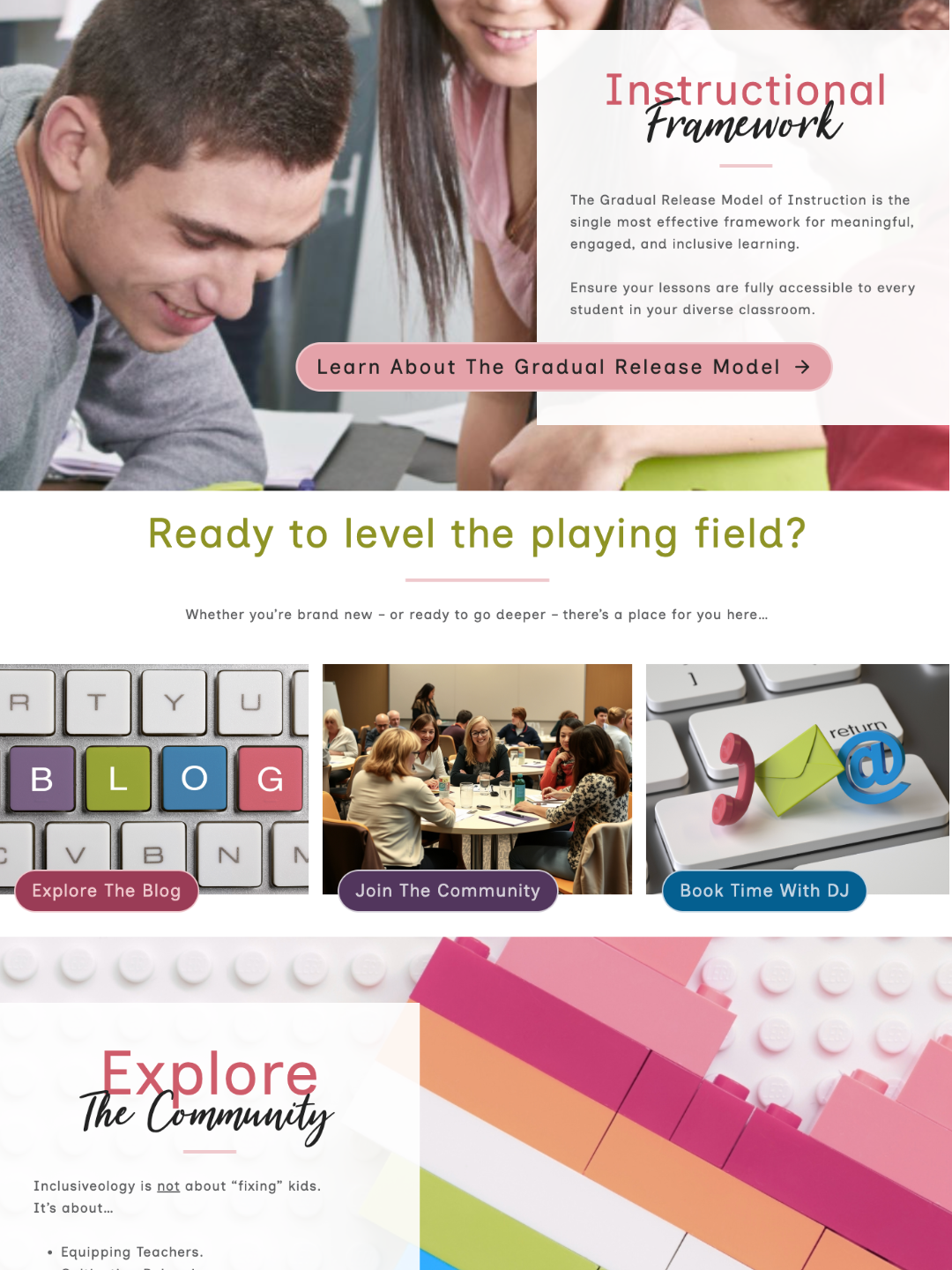
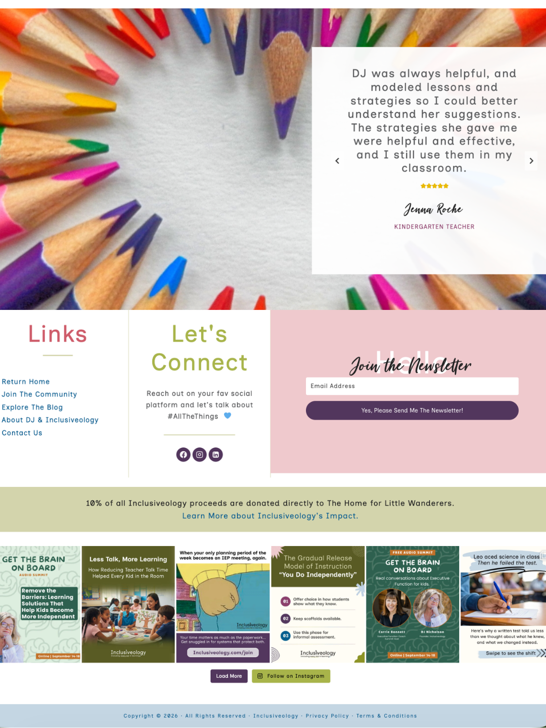
- Multiple paths instead of one. The old site had a single CTA. The new one gives every visitor a next step that matches where they are: grab the free training, read the blog, join the community, or book a call. That's Just Marketing® principles in practice – meeting people where they are instead of pushing everyone toward the same ask.
- A founder people can trust. A welcome section with DJ's own photo and story, plus a plain-language walkthrough of her instructional framework, does the work of establishing expertise before anyone's asked to commit to anything.
- Real accessibility fundamentals. Beyond the look and feel, we ran the new site through an automated scan against WCAG guidelines to catch what a redesign can miss without a technical check – because “accessible” has to hold up under an actual audit, not just a values statement.
The results, four months in
Google Analytics wasn't live until after launch, so there's no clean before-and-after traffic comparison here – but four months of momentum tells its own story. Website sessions grew 67% from the first month tracked to the most recent one, and organic search traffic tripled over that same window. That second number matters most: it's the clearest sign that the content and SEO strategy behind the redesign is compounding, not just holding steady.
On social, Facebook turned out to be the strongest driver of traffic back to the site, while LinkedIn told a quieter but interesting story – impressions dropped over the summer, but link clicks actually went up, meaning the content was landing better with a smaller, more relevant audience of administrators and instructional coaches. Instagram, meanwhile, is doing exactly what it's built for right now: building brand presence with teachers, even if it's not yet a major traffic source.
None of these numbers needed to be inflated to make a good story. That's the point of measuring what's real instead of what's impressive.
What DJ says about it
“I've really appreciated all of the work that we've done, and when I sit down and really reflect on my website, I don't believe there's anyone on the planet who would have knocked it out of the park like you did.
My old website was fine for the time – I don't even wanna look at it now. I'm so proud of this one. I tell people: go to my website, play around, and you're gonna learn everything you need to know about me and Inclusiveology. It's all right there.”
That last line is the whole goal of an accessible website redesign, said back in the client's own words: a visitor should be able to learn everything they need to know without anyone standing next to them explaining it. DJ's put that to the test herself, too – she's mentioned more than once that when she shows the site to people in her own network, the response she hears again and again is that it feels like her.
See the live website: Inclusiveology.com
What this means for your own website
You don't need a full rebrand to borrow the parts of this that matter most for your own site.
- Look at your homepage and count how many calls to action it gives a visitor. If it's exactly one, ask whether that's really the only way someone might be ready to engage with you.
- Read your own longest paragraph out loud. If you lose your breath before the point lands, a visitor's attention checked out well before that too – accessible content and scannable content are the same content.
- And if it's been a while since your site had an actual accessibility check rather than a vibe check, that's worth doing before your next redesign, not after.
An accessible website redesign isn't a nice-to-have layered on top of good marketing. For a values-aligned brand, it is the marketing – the clearest, most concrete way to show the people you serve that you built something with them in mind.
| Curious what an accessible, values-aligned redesign could look like for your own site? Let's connect and talk through what's actually working – and what isn't – on your website right now. |