When it comes to creating online content, the need to be creative and stand out is pretty obvious.
I mean, if you’re putting all the effort into creating content, of course, you want it to stand out enough that people will actually consume it. And it can be tempting to hop on the bandwagon of every new trend online as they’re picking up steam with the hopes and dreams of more followers and likes looming in front of you.
However, as a Just Marketer who actively seeks to be as accessible and inclusive as possible, we play by some different rules than many content creators online.
Sometimes we have to pass on the trends.
Why?
Because too often, they’re simply not accessible and warrant sentiments like this from someone who consumes content using a screen reader:
“It's a bit frustrating and depressing. I don't follow many people, and it's sad to suddenly be shut out of content or a conversation solely because of a text decoration trend.”
If you want to appeal to a broader audience, like, say, the 8.1 million people in the United States who have some form of vision impairment and thus utilize assistive technology like screen readers — stay tuned!
We’re going to dive into some of the simple ways to format your social media copy and content to be more accessible.
The gist: Accessible social media formatting means writing posts that screen readers can read clearly, so people using assistive technology get the full message. Type directly in each platform’s built-in font and choose emojis over emoticons or text art. Columns made with tabs or spaces can also confuse screen readers, so a simple single-column layout works best.
Why Should You Avoid Fancy Fonts on Social Media?
Don't use any alternative characters from external websites to make your content appear in different weights, styles, or fonts.
Cute, creative, and funky fonts are just that — cute, creative, and funky.
But screen readers can only make sense of text that is written in ‘normal’ fonts.
What do I mean by this? The only way to make your social media copy accessible to people who use assistive technology is to stick to the font that appears when you type directly into your social media platform of choice.
Fancy fonts from generator sites are actually Unicode symbols, so screen readers typically read each character’s technical name (like “mathematical bold italic capital H”) – and that will happen for each letter of the word.
Gets pretty annoying, right?
Even if you are comfortable and familiar with this type of screen reading technology, you're not going to want to listen to this content for many reasons, and rightfully so.
- It wouldn’t make any sense.
- It would take tons of time.
- Again…at some point, it’s going to get pretty annoying.
Anyone using assistive technology will likely immediately tune out, keep scrolling, and move on to another piece of content that their screen reader can make sense of.
Content that they can understand too.
That's a problem for you, AND your audience.
The solution?
Just avoid using it altogether!
Are Emoticons and ASCII Art Accessible?
ASCII art (also often referred to as ANSI art, text art, or word art), ASCII art is the forming of pictures or art out of the characters available in the ASCII chart. This includes letters, numbers, and other characters. Standard ASCII has 128 characters, and the extended ASCII has 256 slots available in the 8-bit code.
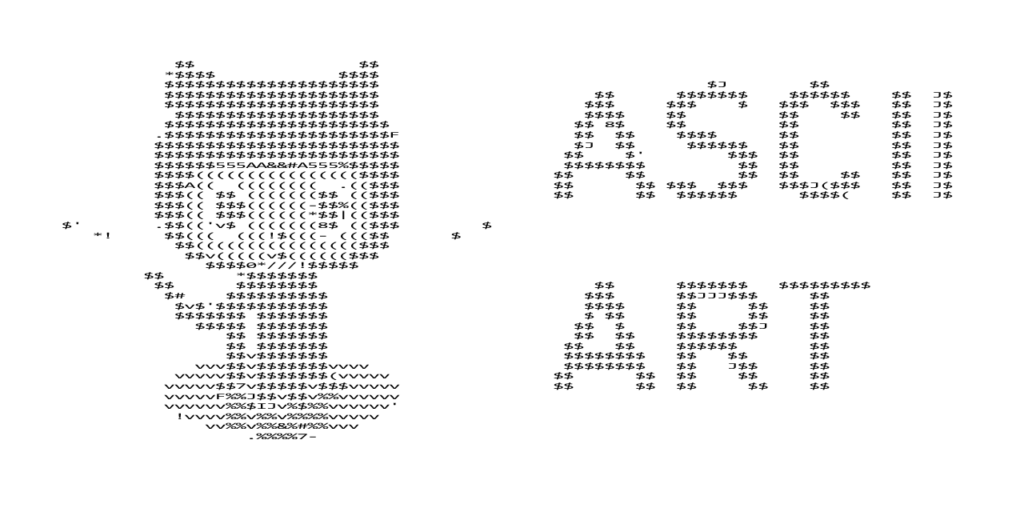
The most simple form of ASCII Art is what many of us used to use to express emotion before the emergence of emojis: emoticons. For example, a colon and parenthesis to depict a smiley face or sad face.
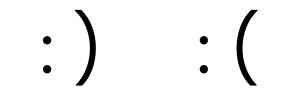
More complex forms include several lines of text to draw large symbols or more complex figures.
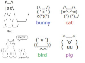
Honestly, they are super impressive and can be fun to look at, but screen readers don’t recognize them like they recognize emojis.
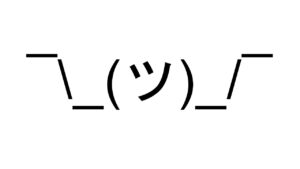
Someone who is accessing your content with a screen reader will not get the intended message at all.
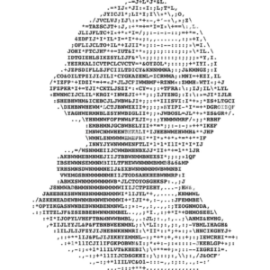
Instead of emoticons, Just Marketing® best practices recommend always using emojis instead because they have alt-text built into them which allows them to be interpreted by assistive technology.
Learn about the unique issues we need to be aware of when it comes to emoji use – yup, even our beloved emoji has some Just Marketing® stipulations we have to be aware of.
How Do Tabs and Spaces Affect Screen Readers?
Some social media users like to use tabs or spaces to create the appearance of two columns in their content (rather than the auto-populated single-column text), but it’s not a good practice to get into.
There are two reasons to avoid this tactic:
- It’s literally impossible for it to format the same on mobile or desktop. If you create the post on mobile, the formatting will not translate to desktop users (and vice versa). So you’re creating a different user experience based on what type of device your content is being consumed on.
- If any of your followers access your content with assistive technology, they won’t understand it because screen readers only read from left to right, one line at a time. So, if you format your copy in any other way, it won’t make any sense and these followers will likely skip past your content to something more accessible.
Assistive Technology Users Deserve Equal Access In The Digital World
Can we avoid the fact that new creative trends will continue to emerge online? No, we cannot.
But can we be mindful and evaluate whether joining that trend will exclude portions of the population? We most certainly can.
We can be intentional about how we write and format our content on social media and the digital world, in general, to better accommodate those who access it in different ways (like with assistive technology!).
So before jumping on a new trend, think about how it will impact different types of people, including people who use assistive technology. The more you evaluate each trend through an equity-centered lens, the easier it will become.
Watch/Listen & Subscribe
Let’s Keep This Conversation Going
You can build a business rooted in consent, clarity, and connection – and you don’t have to do it alone.
Here are a few ways we can stay connected:
Let’s connect on social: Come say “hi” on LinkedIn or Instagram.
Curious what it’s like to work together? If you’re craving more support with ethical, ADHD-friendly marketing systems that actually feel good – explore how we can co-create something sustainable and aligned.
Join the email list: Want weekly-ish tips on content strategy, Just Marketing®, and marketing with ADHD? Sign up for my emails and get real-talk guidance, delivered with kindness and clarity.
FAQs
Fancy fonts from generator websites are usually a struggle for screen readers. These “fonts” are actually special Unicode symbols, so a screen reader may read each character’s technical name, like “mathematical bold capital H,” or skip the text entirely. Typing directly in the platform’s default font keeps your words readable for everyone.
Screen readers announce each emoji using its description, so emojis are more accessible than emoticons or text art. Using a few at a time, placing them at the end of sentences, and avoiding emojis as bullet points or word replacements keeps posts easy to follow. Learn how to use emojis with assistive technology in mind.
Emoticons and ASCII art are built from punctuation and keyboard characters, so a screen reader may read them as a string of symbols. Larger text art can turn into a long, confusing stream of characters that hides your message. Emojis or a short written description work much better.
Type in the platform’s default font, add alt text to images, and include captions on videos. Writing hashtags in CamelCase (#JustMarketing in place of #justmarketing) helps screen readers pronounce them correctly, and plain language makes posts easier for everyone to understand. Learn how to write helpful alt text.
Screen readers read content in order, line by line, from start to finish. Formatting that depends on visual layout, like columns created with tabs or spaces, can come out jumbled. A simple, single-column post reads clearly for screen reader users and looks consistent across devices.
Many trends can be adapted to be accessible, so evaluate each one before jumping in. Ask whether people using assistive technology can fully experience it. When a trend leaves some of your audience out, it’s worth skipping or reworking.